
Executive Summary
Building an interactive dashboard was only part of the challenge. The real objective was designing a reporting solution that could continue delivering value long after deployment while remaining simple, affordable, and easy for non-technical staff to manage.
The Problem
A non-profit organization celebrating its 10-year anniversary needed an interactive dashboard that could showcase a decade of organizational impact while allowing staff to update information without requiring technical expertise or investing in expensive reporting infrastructure.
The Solution
Designed an end-to-end reporting solution using Microsoft Power BI for rapid dashboard prototyping, Google Sheets as the centralized data source, and Looker Studio for a live dashboard that automatically refreshes and can be embedded directly on the organization's website.
Business Impact
Delivered a sustainable, low-cost reporting system that eliminated manual report rebuilding, enabled real-time updates, reduced maintenance effort, and provided stakeholders with an accessible platform to communicate the organization's impact.
Project Context
Understanding the challenge before building the solution.
Unlike many dashboard projects that focus solely on visualization, this engagement required solving a much broader business problem.
The organization was preparing to celebrate its 10 years of impact and wanted an interactive dashboard that could showcase key achievements to donors, partners, and the general public.
The challenge wasn't simply creating an attractive dashboard. It was designing a reporting solution that would remain live, accurate, scalable, easy to maintain, and cost-effective long after deployment.
The dashboard shown in this portfolio contains representative data and modified branding to protect the confidentiality of the organization until they choose to make the project public. The overall structure, visualization approach, and reporting workflow accurately reflect the production solution that was delivered.
The Challenge
Before any dashboard could be designed, the biggest obstacle was transforming nearly a decade of fragmented organizational data into a reliable reporting system that was easy to maintain and affordable to operate.
At the beginning of the project, there was no centralized reporting system capable of bringing together years of organizational data. Information existed across multiple files and formats, making it difficult to measure impact, identify trends, or communicate the organization's achievements effectively.
Historical Data
Collecting nearly ten years of organizational data from multiple independent sources.
Data Cleaning
Cleaning, validating, and standardizing inconsistent datasets before analysis.
Data Modeling
Organizing historical information into a structured reporting model suitable for analytics.
Meaningful KPIs
Designing impact metrics that donors, executives, and partners could understand instantly.
Non-Technical Users
Allowing staff to update information without relying on a developer or Power BI expertise.
Low-Cost Hosting
Finding an online reporting solution with little to no ongoing infrastructure cost.
The Turning Point
The final requirement became the most interesting challenge. Although the first dashboard had already been developed in Microsoft Power BI, conversations with the client revealed a much broader business need.
Rather than rebuilding reports every time new information became available, they wanted a dashboard that could live on their website and update automatically whenever staff entered new data.
My Solution
I approached the project in three distinct phases, gradually transforming raw historical data into an automated reporting system that could be maintained by non-technical users.
Data Collection & Preparation
The project began by gathering historical organizational data spanning ten years. This stage focused on preparing a reliable dataset before any visualization work could begin.
- Data collection
- Data cleaning
- Removing inconsistencies
- Standardizing formats
- Structuring datasets for analysis
Like most analytics projects, preparing the data consumed far more time than building the dashboard itself.
Dashboard Design
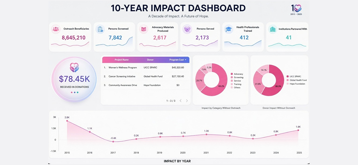
After completing the data model, I designed the first dashboard in Microsoft Power BI, focusing on clarity, storytelling, and executive-level reporting.
Every visualization was designed to help executives understand organizational performance within seconds while still allowing deeper exploration of the data.
Solving the Automation Problem
During stakeholder discussions, a new requirement emerged. Staff wanted to update data without opening Power BI or relying on a developer to rebuild reports.
After evaluating multiple approaches, I designed a lightweight, cloud-based workflow using:
Staff now only needed to update a spreadsheet, while the dashboard refreshed automatically and remained available on the organization's website.
Dashboard Highlights
The completed dashboard provides decision-makers with an interactive, executive-level view of organizational performance while making reporting simple, accessible, and continuously up to date.
Executive KPI Cards
Key organizational metrics presented in a clean executive dashboard.
Donation Tracking
Monitor donations and funding trends across multiple years.
Project Portfolio
Comprehensive overview of organizational projects and initiatives.
Donor Analysis
Understand donor contributions and funding distribution.
Impact Trends
Explore year-over-year organizational growth and impact.
Interactive Reporting
Dynamic filters allow users to explore the data with ease.
Technical Stack
Business Intelligence
Data
Analytics
Skills Demonstrated
What I Learned
This project reinforced that successful analytics engagements are rarely just about building dashboards. The greatest value came from understanding how the client actually worked and designing a reporting solution around their daily workflow rather than simply delivering the technology they initially requested.
It strengthened my ability to ask deeper questions, identify operational constraints, and choose technologies based on business needs instead of personal preference.
Most importantly, it reinforced my belief that great Business Intelligence solutions should not only provide insights but should also remain sustainable, accessible, and easy for end users to maintain long after deployment.
Project Category
Business Intelligence • Non-Profit Analytics • Data Automation • Executive Reporting • Dashboard Development
Technology Stack
Microsoft Power BI • Google Looker Studio • Google Sheets • Data Modeling • Data Cleaning • Workflow Automation